Inventory Forecasting with AI
5. Feature Engineering I – A Leap in Accuracy
DL model selection
In the previous part we decided to base further development on deep-learning architectures. To keep future visualisations readable I will focus mainly on Temporal Fusion Transformer (TFT). Three key arguments led me to this choice:
- Scaling with complexity – the richer and more granular the dataset (dozens of features, promo flags, seasonality, relative indicators) the more clearly TFT outperforms other models.
- DeepAR limits on the long tail – DeepAR tends to pull low-volume or sporadic SKUs down to zero, distorting purchase plans for slow-moving yet important items.
- Attention = smart feature selection – TFT automatically decides which input columns matter at any moment and can explain that choice; a major benefit when you have 100 + features.
At first DeepAR seemed to achieve comparable metrics with lower compute demand, but once we enriched the inputs with more complex seasonal, promo and relative signals the picture flipped: TFT kept scaling while DeepAR hit its limits.
Scenario 1 – why it is wrong
During further testing the drawback of the first scenario became obvious – training and validation data were identical.
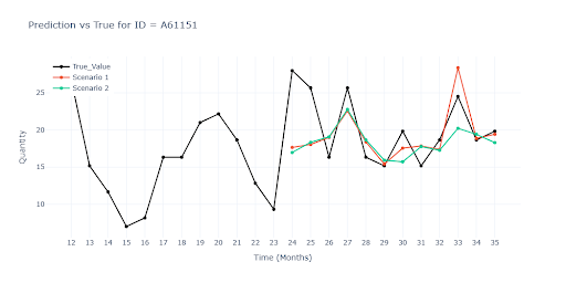
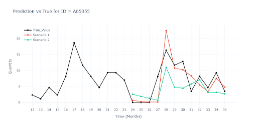
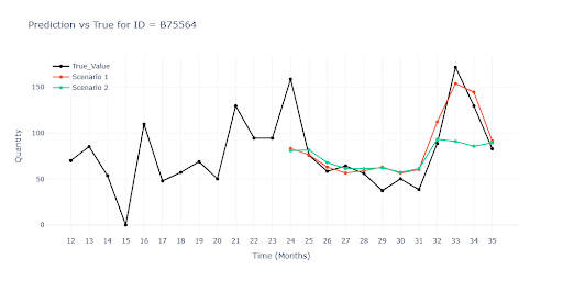

The charts show that Scenario 1 tracks reality very closely throughout, because the model had a chance to “see the future”. Once we withheld the last three months (Scenario 2) the gap appeared quickly. On the final chart with a seasonal item the model fails completely.
| Metrics | Scenario 1 | Scenario 2 | ||
|---|---|---|---|---|
| Value (ALL) | Value (Item) | Value (ALL) | Value (Item) | |
| WAPE | 32.1632 | 45.7959 | 53.1177 | 66.9848 |
| RMSE | 62.0655 | 25.2746 | 83.1493 | 45.7434 |
| R² | 0.8603 | 0.7754 | ||
| MAPE | 63.9494 | 95.889 | ||
| ROBUST | 0.4796 | 66.0129 | 0.4184 | 98.0722 |
| STABLE | 0.3819 | 0.4615 | ||
When reviewing Scenario 2 results we can see the model has some predictive power, especially for SKUs with long and stable history, but the results are still well below expectations. Three key weaknesses emerged:
- Low-turnover items – forecasts dropped to zero; risk of under-stocking the long tail.
- Promo peaks – without an explicit discount signal the models reproduced the uplift only partially.
- Seasonal cycles – for highly seasonal items the models underestimated the amplitude of summer and Christmas peaks.
It was clear the network needs additional inputs to read the context missing from raw numbers – feature engineering.
What are features?
When working with AI on time series, each data row represents a Product (ID) × Time point (e.g., item A in March 2024). Everything else in that row – segment, category, sales, price – we call features. These columns provide the model with the context it needs: they help it understand a product’s behaviour over time, its similarity to others, and the influence of external factors such as promos or season.
Why?
- A raw sales number tells only how many units were sold.
- Features add the why: it was August, a discount was running, the item is new, high season is peaking.
Thanks to this the model can recognise patterns it would never extract from a plain sales series.
How the model works with features
As noted, each row in our dataset is a Product (ID) × Month (time_idx) pair. Everything else on that row counts as a feature.
Feature list for the project dataset:
ID, seasonality, category, type, segment, segment 1, segment 2, name, turnover, date, time_idx, weight, SALE, SALE_INTENSITY, product_volume__bin
Three types of features
The basic split is into static and dynamic – that is, whether the values change over time.
Product type is the same for every month, whereas a promo flag appears only in certain months.
| Feature type | Example | How it helps the model |
|---|---|---|
| Static | Product type, SKU ID, category, segment | Lets the model share patterns across similar items and supports new products that have very little history. |
| Dynamic – known | Calendar date, discount flag | Values change month by month and are known in advance, so the model can “look ahead” (e.g., it already knows when a promo will run). |
| Dynamic – unknown | Sales volume | Values change every month and are not known for the future—this is the variable we actually want the model to predict. |
Numerical vs. Categorical features
Numerical (sales, averages, discounts) → fed directly into the network.
Categorical (product type, segment) → turned into embeddings, short vectors learned together with the model.
Why embeddings help
Two vectors that sit “close” in space = two categories whose demand behaves similarly. A brand-new “tools” SKU can instantly benefit from the sales history of “electro-accessories” if their profiles match.
Which features I added—and why
🗓️ Date-encoding
The model doesn’t “see” calendar months, only a numeric index (time_idx = 0 … 36). These features restore that link.
- Harmonic month code (sin / cos) → the network learns that January follows December and the whole year is cyclical.
- Helps capture periodic sales patterns (quarters, years, summer season).
📊 Relative (ratio) features
- Express the deviation or share of a SKU’s sales against a larger whole (group mean, seasonal maximum, long-term trend …).
- The model instantly spots when an item is above or below its norm and reacts faster to unexpected swings.
🌀 Lag & Rolling windows
- Supply detailed information on the recent trajectory.
- Speed up detection of momentum (sales speeding up or slowing down).
- Rolling mean / std filter noise and show whether current sales sit above or below their moving average.
🌊 Wavelet signals
- Decompose the curve into short ripples versus long trends.
- The network simultaneously “sees” fine promo jumps and slow multi-year cycles.
📈 Trend
- Adds direction and slope of sales.
- Provides context on how sales fluctuate around their mean.
🔢 Absolute and log values
Most features are created both in raw and logarithmic form.
Why logarithmic?
- Compress extremes → small items aren’t drowned out.
- Stabilises variance; curves sit closer to normal → faster learning.
- Converts multiplicative jumps (×2, ×3) into linear shifts the model can capture easily.
Result
Thanks to this combination of inputs, the model now predicts turnover and understands the context of each month—what is a normal trend, what is an outlier, and what a promo spike looks like.
After several rounds of tuning I settled on about 75 features—the sweet spot where metrics improved the most without blowing up training time or GPU memory. Adding more columns brought only marginal gains while slowing training dramatically, and some features even started to interfere with one another.
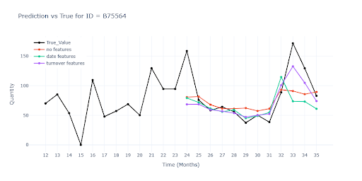
The charts compare three model variants:
- Red curve – baseline forecast without any extra features.
- Green curve – baseline plus harmonic date-encoding (sin/cos month).
- Purple curve – same model further enriched with relative and rolling features derived from turnover.
The contrast between the curves shows how each feature bundle improves—or shifts—the model’s ability to track real sales.

The table illustrates how extra information pushes model quality upward:
| Metrics | no features | date features | turnover features | |||
|---|---|---|---|---|---|---|
| Value (ALL) | Value (Item) | Value (ALL) | Value (Item) | Value (ALL) | Value (Item) | |
| WAPE | 53.1177 | 66.9848 | 32.0651 | 46.7711 | 30.2608 | 44.5829 |
| RMSE | 83.1493 | 45.7434 | 72.175 | 25.1354 | 46.1427 | 22.3537 |
| R² | 0.7754 | 0.8111 | 0.9012 | |||
| MAPE | 95.889 | 62.9665 | 60.0505 | |||
| ROBUST | 0.4184 | 98.0722 | 0.4907 | 65.2697 | 0.4948 | 62.2027 |
| STABLE | 0.4615 | 0.3839 | 0.365 | |||
What the numbers say
- Moving from zero features to just date-encoding (harmonic month, quarter, …) cuts error by dozens of percentage points—the model now “gets” seasonality.
- Adding turnover features (relative ratios, lags, rolling windows) shaves off a few more points and, more importantly, slashes RMSE.
- The gap between the two enriched models is smaller; to judge which feature bundle truly pays off, you have to look beyond aggregate scores—zoom in on specific scenarios (seasonal peaks, promo spikes, long-tail SKUs). That’s why visual analysis is essential: contrasting curves reveal nuances and point you to precise problem types.
Impact of feature count on speed
On a test sample I measured how resource usage grows with more features (13 features = baseline).
| Features | Training time | GPU memory |
|---|---|---|
| 120 | x 7 | x 2,5 |
| 444 | x 26 | x 6 |