Inventory Forecasting with AI
3. How to validate this?
The core question before any modelling
Validation must show how the model handles data it has never seen—exactly the situation in production. So the dataset has to be split:
- Training data – the model learns patterns here.
- Validation (test) data – we check what the model really knows here.
But where to draw the line? I wanted to feed the model every possible hint—all SKUs and all 36 months—to capture as many patterns as possible. Yet part of the timeline had to stay hidden; otherwise the network would simply memorise history and crash in the real world.
Solution? I built three validation scenarios of increasing strictness, from a “quick check” (the model validates only on data it already saw) to a hard test on truly unseen months.
3 Validation Scenarios
- Scenario 1 – Smoke test Validation on the same dataset used for training (all 36 months). Goal: make sure the model can find patterns and predict values it has already seen—while watching for overfitting.
Scenario 2 – Semi-strict Training on 33 months, validation on the last 6 months (split 3 + 3: three months the model saw during training, three it did not).
This setup is much closer to real deployment: the model first “walks through” history, learns the patterns, and only then predicts a fresh, unknown period. It lets us:
- Test generalisation – can the model extend the trend, or does it just echo the past?
- Spot shifts in seasonality – e.g. will it handle the Christmas peak or other patterns?
- Check promo impact – are forecasts influenced by planned discount campaigns?
- Gauge sensitivity to new items – the last months often contain SKUs with a short history; validation shows right away how the model copes with a changing assortment.
Scenario 3 – Strict Same training window as Scenario 2; validation = only the last 3 unseen months. I use this as a control check.
Only after I was satisfied with the results did I train the final version on the full dataset (no hold-out), so the model could leverage 100 % of the data for live deployment in the warehouse.
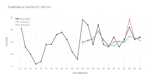
Note: All metrics and charts shown later in the article come from Scenario 2 (unless explicitly stated otherwise). Metrics are calculated on the final 3 + 3 months; visuals use a 12-month window for clarity.
The next graph illustrates the gap between Scenario 1 and Scenario 2. Red = Scenario 1, where the model saw every outcome during training. Green = Scenario 2, where the last three months were hidden. It is clear that unseen data must be included in validation from day one.
Which metric to choose when you can’t manually inspect every SKU?
In day-to-day practice people reach for R², RMSE or MAPE—so why invent anything else?The core trouble is the presence of zeros and the huge spread of values.
Why are zeros an issue?
Imagine the model predicts a turnover of 2 units for a month, while the real sales were zero. A difference of only two pieces, yet a percentage metric such as MAPE explodes, because you divide by zero (or by a tiny number). The same happens with RMSE: a few “small” deviations on high-volume items can inflate the total error and completely hide how well the model performs on key SKUs.
Why is high value variability a problem?
| Item | Actual sales | Predicted sales | Absolute error | Relative error |
|---|---|---|---|---|
| A (low-volume) | 5 pcs | 8 pcs | 3 pcs | 0.6 |
| B (high-volume) | 5 000 pcs | 4 800 pcs | 200 pcs | –4 % |
- MAPE shoots up because of item A (60 %), even though we’re talking about ±3 pieces.
- RMSE instead highlights item B (200 pcs), being highly sensitive to large absolute errors.
- R² may look superb (99 % of variance explained) thanks to high-volume items, yet tells us little about “small” SKUs
No single metric is enough. With extreme variability and lots of zeros or small items, I had to switch to a combination of metrics to get a fair view of model quality.
| Metric | What it measures | Note | Goal |
|---|---|---|---|
| WAPE (Weighted Absolute Percentage Error) | What % of total sales the model “missed”. | Sensitive to SKUs with zero sales. | ⬇️ |
| RMSE (Root Mean Squared Error) | On average, by how many units the model was off. | Sensitive to high-volume SKUs. | ⬇️ |
| R² (Coefficient of determination) | How much of the variation in sales the model correctly “explains”. | Strongly influenced by high-volume SKUs. | ⬆️ |
| MAPE (Mean Absolute Percentage Error) | Average percentage error per item. | Sensitive to low-volume SKUs. | ⬇️ |
| Robust score | Composite of accuracy, deviation control and trend-direction match (1 = great, 0 = poor). | Captures whether the forecast follows rising/falling trends. | ⬆️ |
| Stable score | WAPE plus extra checks on deviations and relative error for small sales (0 = great). | Make sure the forecast is smooth and not overreacting on low-volume items. | ⬇️ |
Goal tells us which direction we want the number to move (low ⬇️ or high ⬆️).
My primary yard-sticks are WAPE, RMSE and R².
- MAPE is not reliable for highly variable SKUs.
- Robust and Stable serve mainly as “concept checks”; once the model is roughly tuned, those scores hardly change.
Isn’t that too simple?
During training I ran into one more snag:
Dataset-wide scores look fine, but they don’t flag outliers at the SKU level. So I expanded each metric into two flavours:
| Metric version | How it’s computed | What question it answers |
|---|---|---|
| Whole-dataset | All SKUs are concatenated into one long vector, then the metric is calculated. | How many units do we miss in total? → direct financial impact on inventory. |
| Per-SKU average | The metric is computed for every item first, then the item-level values are averaged. | How accurate is the forecast for a typical product? → quality across the entire assortment. |
Below is an example of these metrics for a two-layer neural network with a soft-plus normaliser. Note the gap between WAPE and MAPE—the very issue discussed above.
| Metric | Value (ALL) | Value (Item) |
|---|---|---|
| WAPE | 50.1925 | 387.2097 |
| RMSE | 69.0821 | 31.4245 |
| R² | 0.6239 | |
| MAPE | 107.1253 | |
| ROBUST | 0.455 | 207.7031 |
| STABLE | 0.5869 |
| Metric | Value (ALL) | Value (Item) |
|---|---|---|
| WAPE | 31.1611 | 44.6504 |
| RMSE | 50.2607 | 26.5974 |
| R² | 0.9084 | |
| MAPE | 75.7044 | |
| ROBUST | 0.5226 | 84.916 |
| STABLE | 0.3901 |
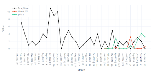
Visual inspection still matters
Even with a full battery of metrics I discovered that visual examination of the curves is essential. Certain item profiles—special-purpose SKUs, long stretches of zeros, strong seasonality—can hide poor forecasts inside otherwise “good” global scores.
The chart below illustrates the point.
On paper the metrics are acceptable, yet the forecast for the final months (red) collapses to almost zero. This happens frequently with ultra-low-volume items.
| Metric | Value (ALL) | Value (Item) | Value (ALL) | Value (Item) |
|---|---|---|---|---|
| WAPE | 41.2218 | 61.4738 | 34.7262 | 51.7859 |
| RMSE | 67.3586 | 29.0839 | 48.2791 | 23.7958 |
| R² | 0.7453 | 0.8691 | ||
| MAPE | 82.3626 | 70.7658 | ||
| ROBUST | 0.4432 | 88.1001 | 0.4785 | 77.5447 |
| STABLE | 0.4872 | 0.418 | ||
| Red line | Green line | |||
Note: In every chart the actual sales are drawn in black, forecasts in colour—so the gap is obvious at a glance.